During these last few weeks, I’ve been working on a React application using Material-UI components. Part of the application involved the user filling in some data in a form. In this post, we’ll see how to implement a form that saves its values in state variables using Material-UI components.
A Material-UI form
We’ll implement a form with the following components:
- Name text field.
- Age text field.
- Gender radio group.
- Select component with OS options.
- Slider for the user’s favorite number.
We’ll not focus too much on the graphical presentation, but rather on the functionality.
Necessary module imports
For simplicity, we’ll have all of our components in the same file. The imports that will be necessary are:
import React, { useState } from "react";
import Grid from "@material-ui/core/Grid";
import TextField from "@material-ui/core/TextField";
import FormControlLabel from "@material-ui/core/FormControlLabel";
import FormControl from "@material-ui/core/FormControl";
import FormLabel from "@material-ui/core/FormLabel";
import RadioGroup from "@material-ui/core/RadioGroup";
import Radio from "@material-ui/core/Radio";
import Select from "@material-ui/core/Select";
import MenuItem from "@material-ui/core/MenuItem";
import Slider from "@material-ui/core/Slider";
import Button from "@material-ui/core/Button";
State variables
We’ll use a functional component that will save the form’s data in a state variable. To do so, we’ll use React’s useState:
const [formValues, setFormValues] = useState(defaultValues)
defaultValues is an object initialized with properties for each form value:
const defaultValues = {
  name: "",
  age: 0,
  sex: "",
  os: "",
  favoriteNumber: 0,
};
Name text field
The first form component will be a text field for the user’s name.
<TextField
  id="name-input"
  name="name"
  label="Name"
  type="text"
  value={formValues.name}
  onChange={handleInputChange}
/>
The value of this text field will be saved in formValues.name. State variables cannot be changed directly, so we need to implement a special function handleInputChange to reflect the changes of the text field on the state formValues.
Handling input changes
When we created the state variable formValues, useState also returned a function to modify the state’s value: setFormValues.
const [formValues, setFormValues] = useState(defaultValues)
We’ll make use of this function to modify the state when the form values change. As we saw above, we passed the handleInputChange function to the onChange attribute. Each time the text field’s content changes, this function is called with an event argument. This argument contain the information necessary to update the state. We can see the implementation of the handleInputChange function below.
const handleInputChange = (e) => {
  const { name, value } = e.target;
  setFormValues({
    ...formValues,
    [name]: value,
  });
};
See that we don’t change the name property of the state formValues directly. We use the function setFormValues to modify it.
Age input field
Similarly, we create a text field for the user’s age.
<TextField
  id="age-input"
  name="age"
  label="Age"
  type="number"
  value={formValues.age}
  onChange={handleInputChange}
/>
The only notable difference is that we’ve set the type attribute to type="number". By doing so, only valid number strings will be accepted.
Gender radio group
The radio group will contain three options: male, female and other. In Material-UI, we need the special components FormControl and RadioGroup to group the radio options.
<FormControl>
  <FormLabel>Gender</FormLabel>
  <RadioGroup
    name="gender"
    value={formValues.gender}
    onChange={handleInputChange}
    row
  >
    <FormControlLabel
      key="male"
      value="male"
      control={<Radio size="small" />}
      label="Male"
    />
    <FormControlLabel
      key="female"
      value="female"
      control={<Radio size="small" />}
      label="Female"
    />
    <FormControlLabel
      key="other"
      value="other"
      control={<Radio size="small" />}
      label="Other"
    />
  </RadioGroup>
</FormControl>
It’s important to set the attribute name to the corresponding property of the state variable formValues. The string passed to name is used by the handleInputChange function to modify the value of the corresponding property. The key attribute is used by React and it should be unique for each option.
Select component
The select component will include three options for the user’s favorite OS: Linux, Windows or Mac. Just like for the radio component, we’ll need the FormControl component to group the Select options, each of which is a MenuItem component. Here as well, the key attribute should be unique among the select options.
<FormControl>
  <Select name="os" value={formValues.os} onChange={handleInputChange}>
    <MenuItem key="mac" value="mac">Mac</MenuItem>
    <MenuItem key="windows" value="windows">Windows</MenuItem>
    <MenuItem key="linux" value="linux">Linux</MenuItem>
  </Select>
</FormControl>
Slider component
Finally, we’ll include a Slider component for the user to select his favorite number between “1”, “2”, and “3”. We’ll render the Sliderinside a div element to handle its size.
<div style={{ width: "400px" }}>
  Favorite Number
  <Slider
    value={formValues.favoriteNumber}
    onChange={handleSliderChange("favoriteNumber")}
    defaultValue={1}
    step={1}
    min={1}
    max={3}
    marks={[
      {
        value: 1,
        label: "1",
      },
      {
        value: 2,
        label: "2",
      },
      {
        value: 3,
        label: "3",
      },
    ]}
    valueLabelDisplay="off"
  />
</div>;
The marks to show on the slider are passed as an array of objects with a value and a label. An important difference is that we’re using a special function for the onChange attribute: handleSliderChange. Unfortunately, setting the name attribute to name=favoriteNumberdidn’t work as with the other form components. As a workaround, we call the handleSliderChange function with the property name "favoriteNumber" directly.
const handleSliderChange = (name) => (e, value) => {
  setFormValues({
    ...formValues,
    [name]: value,
  });
};
Form submit
Finally, we’ll include a submit button.
<Button variant="contained" color="primary" type="submit">
  Submit
</Button>
We can create a function to be called on submit: handleSubmit. As an example, we’ll just print the state variable on the console.
const handleSubmit = (event) => {
  event.preventDefault();
  console.log(formValues);
};
It should be passed to the form as the onSubmit attribute:
<form onSubmit={handleSubmit}>
With this, we have completed the form!
Complete code
Putting all of the pieces together, we’ll have the following code:
import React, { useState } from "react";
import Grid from "@material-ui/core/Grid";
import TextField from "@material-ui/core/TextField";
import FormControlLabel from "@material-ui/core/FormControlLabel";
import FormControl from "@material-ui/core/FormControl";
import FormLabel from "@material-ui/core/FormLabel";
import RadioGroup from "@material-ui/core/RadioGroup";
import Radio from "@material-ui/core/Radio";
import Select from "@material-ui/core/Select";
import MenuItem from "@material-ui/core/MenuItem";
import Slider from "@material-ui/core/Slider";
import Button from "@material-ui/core/Button";

const defaultValues = {
  name: "",
  age: 0,
  gender: "",
  os: "",
  favoriteNumber: 0,
};

const Form = () => {
  const [formValues, setFormValues] = useState(defaultValues);

  const handleInputChange = (e) => {
    const { name, value } = e.target;
    setFormValues({
      ...formValues,
      [name]: value,
    });
  };

  const handleSliderChange = (name) => (e, value) => {
    setFormValues({
      ...formValues,
      [name]: value,
    });
  };

  const handleSubmit = (event) => {
    event.preventDefault();
    console.log(formValues);
  };

  return (
    <form onSubmit={handleSubmit}>
      <Grid container alignItems="center" justify="center" direction="column">
        <Grid item>
          <TextField
            id="name-input"
            name="name"
            label="Name"
            type="text"
            value={formValues.name}
            onChange={handleInputChange}
          />
        </Grid>
        <Grid item>
          <TextField
            id="age-input"
            name="age"
            label="Age"
            type="number"
            value={formValues.age}
            onChange={handleInputChange}
          />
        </Grid>
        <Grid item>
          <FormControl>
            <FormLabel>Gender</FormLabel>
            <RadioGroup
              name="gender"
              value={formValues.gender}
              onChange={handleInputChange}
              row
            >
              <FormControlLabel
                key="male"
                value="male"
                control={<Radio size="small" />}
                label="Male"
              />
              <FormControlLabel
                key="female"
                value="female"
                control={<Radio size="small" />}
                label="Female"
              />
              <FormControlLabel
                key="other"
                value="other"
                control={<Radio size="small" />}
                label="Other"
              />
            </RadioGroup>
          </FormControl>
        </Grid>
        <Grid item>
          <FormControl>
            <Select
              name="os"
              value={formValues.os}
              onChange={handleInputChange}
            >
              <MenuItem key="mac" value="mac">
                Mac
              </MenuItem>
              <MenuItem key="windows" value="windows">
                Windows
              </MenuItem>
              <MenuItem key="linux " value="linux">
                Linux
              </MenuItem>
            </Select>
          </FormControl>
        </Grid>
        <Grid item>
          <div style={{ width: "400px" }}>
            Favorite Number
            <Slider
              value={formValues.favoriteNumber}
              onChange={handleSliderChange("favoriteNumber")}
              defaultValue={1}
              step={1}
              min={1}
              max={3}
              marks={[
                {
                  value: 1,
                  label: "1",
                },
                {
                  value: 2,
                  label: "2",
                },
                {
                  value: 3,
                  label: "3",
                },
              ]}
              valueLabelDisplay="off"
            />
          </div>
        </Grid>
        <Button variant="contained" color="primary" type="submit">
          Submit
        </Button>
      </Grid>
    </form>
  );
};

export default Form;
Presentation
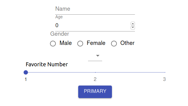
Running the application containing this component, we’ll get the following visual representation:
We can verify that filling the form will update the state variable:
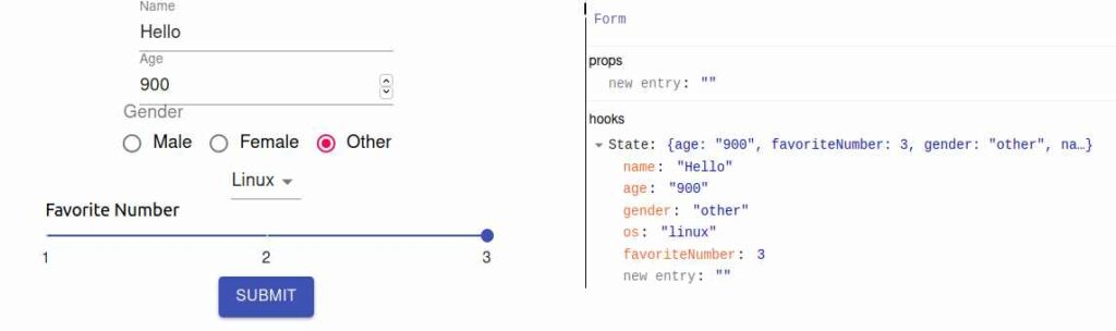
Finally, when we click on the submit button, we get the following log on the console:
Object { name: "Hello", age: "900", gender: "other", os: "linux", favoriteNumber: 3 }
With this, we have finished this tutorial to create forms using Material-UI. In future posts, we’ll see how to validate the form values so that we submit the values only when they satisfy certain conditions, and also how to test the form using the React Testing Library.
Thank you.