In this post, we’ll see how to customize the arrow and label colors of a Material-UI select.
Creating a select component
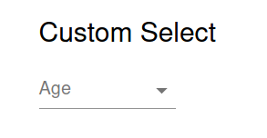
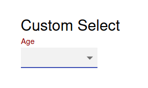
We’ll start by creating a simple select component without any custom colors.
const SelectComp = () => {
  return (
    <Container maxWidth="sm">
      <Typography variant="h5">Custom Select</Typography>
      <FormControl>
        <InputLabel id="simple-select">
          Age
        </InputLabel>
        <Select
          labelId="simple-select"
          id="demo-simple-select"
        >
          <MenuItem value={10}>Ten</MenuItem>
          <MenuItem value={20}>Twenty</MenuItem>
          <MenuItem value={30}>Thirty</MenuItem>
        </Select>
      </FormControl>
    </Container>
  );
};
It consists of a select labeled Age with 3 options: Ten, Twenty, and Thirty.
Customizing with the theme colors
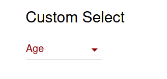
The simpplest option is to use the primary and secondary Theme colors.
...
<InputLabel id="simple-select" color="primary">
  Age
</InputLabel>
<Select
  labelId="simple-select"
  id="demo-simple-select"
  color="primary"
>
This will change the label’s color as we wish, but it will not affect the select’s arrow icon.
primary theme colorIn order to make more intricate changes, we’ll need to apply custom CSS rules.
Applying custom CSS rules with makeStyles
We can apply CSS rules to Material-UI components using the makeStyles function, allowing us with a great deal of customizing options.
Styling the InputLabel
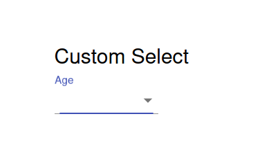
First, let’s change the label colors. We’ll create a custom rule called label using makeStyles.
const useStyles = makeStyles({
  label: {
    color: "darkred",
    "&.Mui-focused": {
      color: "darkred",
    },
  },
});
The color: "darkred" will be applied directly to the InputLabel component. In order to change the label color when it’s focused, we create a nested rule to be applied to the class .Mui-focused. This CSS class was found by inspecting the label using the developer tools. We’ll see how to do it with the select’s arrow icon.
Applying the style on the InputLabel, we’ll have:
const SelectComp = () => {
  const classes = useStyles();

return (
  ...
    <InputLabel id="simple-select" color="primary" className={classes.label}>
      Age
    </InputLabel>
  ...
  );
};
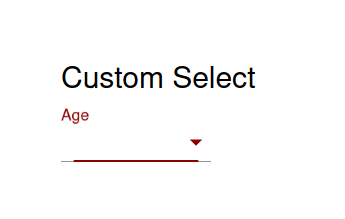
The styled label will look as follows:
Styling the Select component
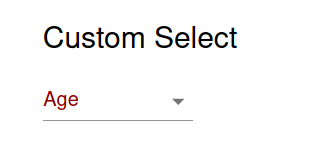
As it was seen above, we cannot directly change the arrow’s color using theme colors. In order to change it, we will apply the following rules to it:
const useStyles = makeStyles({
  ...
  select: {
    "&:after": {
      borderBottomColor: "darkred",
    },
    "& .MuiSvgIcon-root": {
      color: "darkred",
    },
  },
});
The first rule &:after will change the border’s bottom color. Material-UI uses a ::after pseudo-element when the Select component is activated, this is why this rule need to be applied this way.
The second nested rule was determined using the developer tools. By inspecting the arrow icon, we found out it belongs to the classes MuiSvgIcon-root and MuiSelect-icon. That’s why the second nested rule was applied to the "& .MuiSvgIcon-root" class.
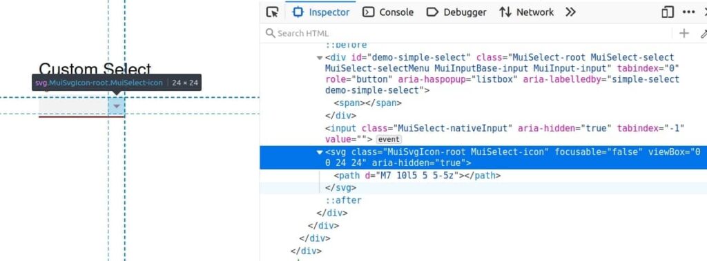
We apply this rules just like we did for the label.
const SelectComp = () => {
  const classes = useStyles();

  return (
  ...
    <Select
      labelId="simple-select"
      id="demo-simple-select"
      className={classes.select}
    >
      <MenuItem value={10}>Ten</MenuItem>
      <MenuItem value={20}>Twenty</MenuItem>
      <MenuItem value={30}>Thirty</MenuItem>
    </Select>
  ...
  );
};
After applying the style rules, we’ll get the result we were looking for!
As a bonus, you can find the complete code of this demo here.
For a similar topic, you can see how to create Material-UI forms.
Very helpful, thank you.